
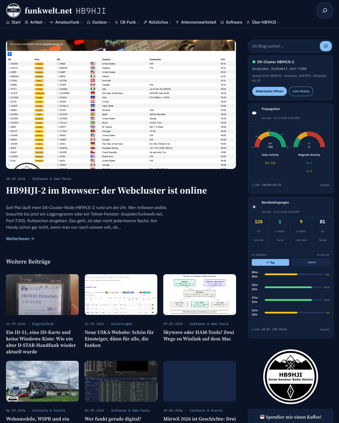
If you have dropped by over the last few days, you will have noticed: the site looks different. Dark instead of light, a serif typeface in the headings, a sidebar on the right with the cluster and the solar data, and just a handful of menu items at the top instead of the long row. This is not an off-the-shelf theme. I built it myself, together with Claude, over one weekend and two evenings. Here is the story behind it, including the places where things got stuck.
Why bother?
Two reasons. The first was clutter. Over the years, more than a hundred categories had grown here, not planned but simply accumulated: one for every antenna, one for every contest, one for every side project. Anyone looking for a post got a category tree that not even I knew by heart any more. I had wanted to tidy it up for months, and I knew it would take more than shuffling a few things around.
The second reason was sheer enthusiasm. I write software for amateur radio, I build antennas, yet for years my own website had been running on a ready-made theme I never really understood. I wanted one that belongs to me. Every line of CSS, every template, every decision.
What is new
The design is now dark only. Navy as the base colour, a blue accent, headings in Source Serif, body text in IBM Plex. The fonts sit on my own server, and the map and chart libraries no longer come from third-party servers either, but from a small plugin of my own. On the pages I checked, not a single request goes to unpkg, cdnjs or jsdelivr any more. That keeps things clean under the nDSG (the Swiss data protection act) and makes the site noticeably faster, because the map library now only loads where there actually is a map.
The more than one hundred categories have become eight sections: Guides, Outdoor, Contests & Events, Reviews & Setups, CB Radio, Digital Modes, Antenna Building, Software & Ham Tools. Plus «General» for everything else. I moved 580 posts and deleted 109 categories. Whatever they contained lives on as tags: POTA, BOTA, D-STAR, HB9AF and so on. If you follow an old category link, you still end up in the right place: 115 old category addresses, 5 relocated pages and 15 calculator pages redirect, the feeds included. The calculators themselves now live only in the Toolbox, so nothing is maintained twice any more.
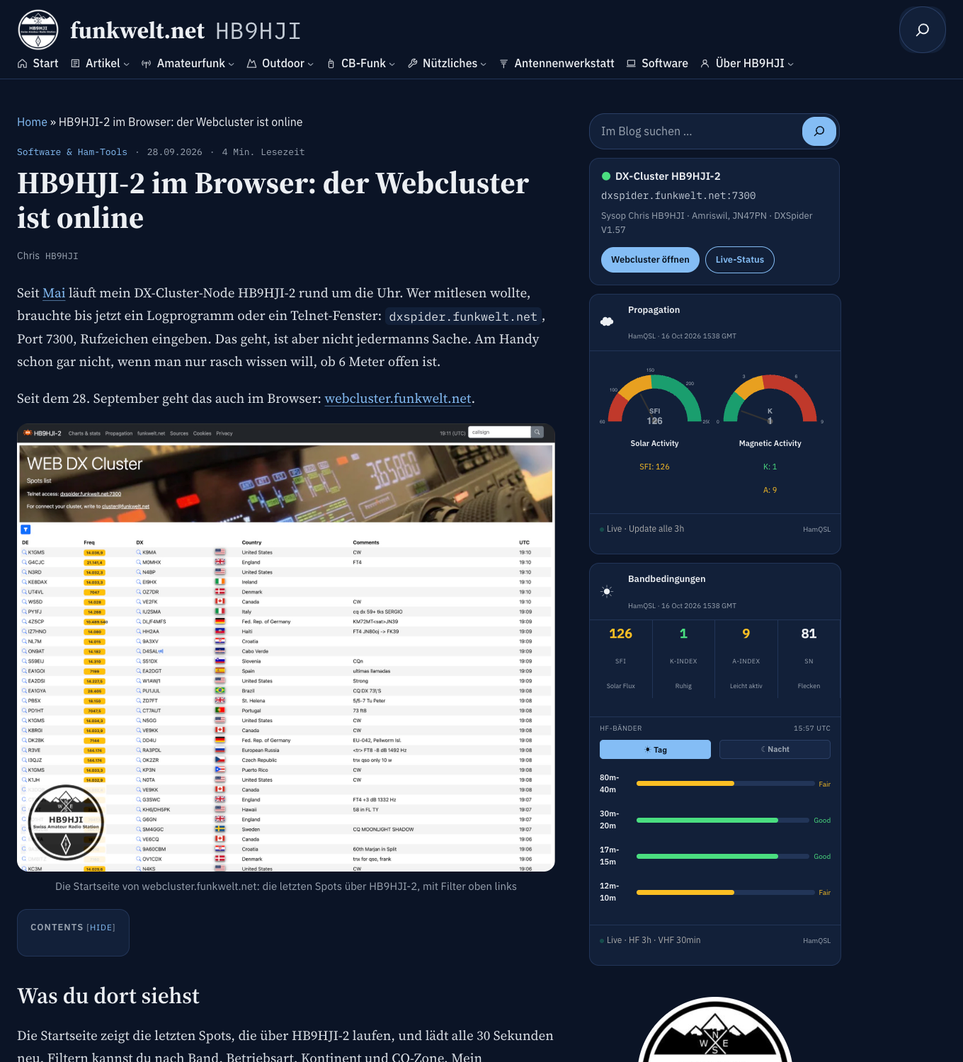
New is the «All posts» page with section chips for filtering. The home page shows the latest post in large format, the grid below it, and on the right the search, the status of HB9HJI-2 and the solar widget. And all my own plugins, the APRS map, the activation planner, the ISS tracker, the CB channel plan, the band plan, the DXCC list, HamLogTools, the repeater map and the others, are now dark. Not rebuilt, but recoloured via CSS; old HTML pages with hard-coded light colours are recoloured automatically when they are served.
Plus a few small things that mattered to me: 232 umlauts in eleven old pages that were still written as ae, oe and ue have been corrected. Comments and the contact form now address you informally with «Du» in German, and the contact form asks for your callsign. And the repeater map now uses OpenStreetMap, because Carto suddenly demanded an API key from one day to the next.
How it fitted into one weekend
With Claude Code in the terminal on my DEV-Mac, in a local WordPress copy, with Git and feature branches, just the way I work on HAM-Tools. The first commit, on 9 October, is called «Grundgerüst Variante C, Magazin dunkel» (basic framework, variant C, dark magazine). On that day alone there were 65 commits and 22 merged branches: header, menu, sections, page moves, dark plugins, accent colour, comments addressing readers informally.
The division of labour was clear. I decide what the site should be: which variant, which colours, which posts go into which section, how far the plugins get reworked. Claude implements it, checks the contrast against the accessibility guidelines and makes sure the block editor still accepts everything. And before a branch goes into the main branch, a second AI takes a look: Codex reviewed the code and came back with eight findings, from locally hosted libraries to link texts for screen readers. I checked each one individually and implemented them all, but checked them, not adopted them blindly.
On 14 October it was the base colour’s turn. The first blue-black felt too harsh to me; after comparing three variants side by side, it became navy. After that the theme was finished, and then it was a matter of waiting.
What went wrong along the way
The hosting provider first. For going live I needed SSH access, and at Hosting Swiss that was blocked for a week because of a chroot problem. Support reproduced it with a test user and gave the all-clear on 16 October. The same afternoon the site was live.
Then the backup that wasn’t one. The first database export dutifully reported «ok». Only the check, counting the tables and looking for «Dump completed», showed: aborted, the posts were missing entirely. Second attempt with a larger packet limit, 54 out of 54 tables. Had I trusted that first «ok», this would have been the story of a different post.
The kses trap. When moving old pages via the command line, WordPress would silently have filtered out the style blocks of the old HTML pages. Claude spotted that in advance, and we worked around it. And after the switch, nginx kept showing the old pages until the cache in Plesk had been cleared.
Tidying up brought two things to light that had nothing to do with the theme: WP-Cron had been at a standstill since 8 October because the scheduled task in Plesk was failing, which is why the Developer Hub was no longer fetching app versions. And the ISS tracker crashed whenever CelesTrak delivered an error page instead of orbital data. Both fixed the same day.
What I take away from it
The rebuild was worth it, not because of the colour, but because I now understand the site. Every template is mine, every script used for going live had a dry run, every step that wrote anything had a backup beforehand and my «go». That is how I want to keep working.
And one rule has been confirmed: a backup only becomes a backup once you have checked it.
Tell me what strikes you about the new design, good or bad. If an old link leads nowhere or a page looks odd in the dark, write it in the comments or send it via the contact form.
73 de Chris, HB9HJI
Leave a Reply